Introducing the Table web component
After a few years of retreating into the darkness out of fear at the slightest whisper of the word "table," we finally mustered the courage to summon the legendary beast <zui-table>.
We punted on building our own Table component for so long because there are a lot of features we need and want to support. We have to make it worthwhile for consumers to want to use our component instead of a third-party's table or recreating their own from scratch. From years of implementing hundreds of native HTML and third-party tables in our Zywave applications, we identified several requirements:
- Searching: refine data in a table to match certain keywords
- Filtering: narrow results based on criteria
- Sorting: sort a column in ascending or descending order
- Editable table cells: allow values within cells to be modified
- Bulk actions: apply mass changes to multiple table rows
- Loading view: visual indication that table and/or table data are loading
- No results view: communicate to users when the table has no data or their search/filter yielded no results
In order to get <zui-table> into the hands of consumers faster, we are releasing it in stages. The first stage introduces Table into our design system with basic features and styles.
First stage - basic Table
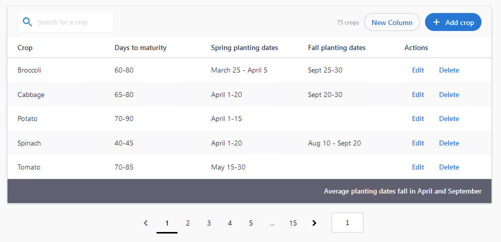
Below is an example of all the basic Table features you can use today.

<zui-table banded>
  <zui-table-topbar>
    <zui-search placeholder="Search for a crop" no-submit></zui-search>
    <div slot="counter">75 crops</div>
    <zui-button class="secondary" slot="action">New Column</zui-button>
    <zui-button class="primary" slot="action"><zui-icon icon="zui-add"></zui-icon> Add crop</zui-button>
  </zui-table-topbar>
  <zui-table-row header>
    <zui-table-cell>Crop</zui-table-cell>
    <zui-table-cell>Days to maturity</zui-table-cell>
    <zui-table-cell>Spring planting dates</zui-table-cell>
    <zui-table-cell>Fall planting dates</zui-table-cell>
    <zui-table-cell>Actions</zui-table-cell>
  </zui-table-row>
  <zui-table-row>
    <zui-table-cell>Broccoli</zui-table-cell>
    <zui-table-cell>60-80</zui-table-cell>
    <zui-table-cell>March 25 - April 5</zui-table-cell>
    <zui-table-cell>Sept 25-30</zui-table-cell>
    <zui-table-cell action>
      <zui-button class="link">Edit</zui-button>
      <zui-button class="link">Delete</zui-button>
    </zui-table-cell>
  </zui-table-row>
  <zui-table-row>
    <zui-table-cell>Cabbage</zui-table-cell>
    <zui-table-cell>65-80</zui-table-cell>
    <zui-table-cell>April 1-20</zui-table-cell>
    <zui-table-cell>Sept 20-30</zui-table-cell>
    <zui-table-cell action>
      <zui-button class="link">Edit</zui-button>
      <zui-button class="link">Delete</zui-button>
    </zui-table-cell>
  </zui-table-row>
  <zui-table-row>
    <zui-table-cell>Potato</zui-table-cell>
    <zui-table-cell>70-90</zui-table-cell>
    <zui-table-cell>April 1-15</zui-table-cell>
    <zui-table-cell></zui-table-cell>
    <zui-table-cell action>
      <zui-button class="link">Edit</zui-button>
      <zui-button class="link">Delete</zui-button>
    </zui-table-cell>
  </zui-table-row>
  <zui-table-row>
    <zui-table-cell>Spinach</zui-table-cell>
    <zui-table-cell>40-45</zui-table-cell>
    <zui-table-cell>April 1-20</zui-table-cell>
    <zui-table-cell>Aug 10 - Sept 20</zui-table-cell>
    <zui-table-cell action>
      <zui-button class="link">Edit</zui-button>
      <zui-button class="link">Delete</zui-button>
    </zui-table-cell>
  </zui-table-row>
  <zui-table-row>
    <zui-table-cell>Tomato</zui-table-cell>
    <zui-table-cell>70-85</zui-table-cell>
    <zui-table-cell>May 15-30</zui-table-cell>
    <zui-table-cell></zui-table-cell>
    <zui-table-cell action>
      <zui-button class="link">Edit</zui-button>
      <zui-button class="link">Delete</zui-button>
    </zui-table-cell>
  </zui-table-row>
  <zui-table-row summary>
    <zui-table-cell style="text-align: right;">
      Average planting dates fall in April and September
    </zui-table-cell>
  </zui-table-row>
  <zui-table-footer>
    <zui-pager current-page="1" total-pages="15"></zui-pager>
  </zui-table-footer>
</zui-table>
See the Table demos for more detailed examples.
Table topbar
Currently, the table topbar is similar to a toolbar. It can accommodate a search bar, counter/number of results, primary action button, and secondary action button. If you have no need for those features, you can omit it entirely or insert a title for your table here. Typically, all actions in the topbar should affect the entire table.
Table header
Similar to a native table, these table headers represent the information presented in each column. We have plans to include sorting and filtering via columns in a future update.
Table summary
The table summary is typically used to display a grand total of values. We don't think this will be used very often, but is necessary for some of our applications.
Table footer
Unlike a native table, our table footer's main purpose is to house pagination. We are considering a feature to allow users to change the amount of results shown per page.
Check out the Table documentation for more detailed information.
Second stage - what's next?
Making Table mobile-friendly and responsive is currently in the works. This is a known difficulty when shipping your own table (where most teams don't ship any responsive design) so we believe this will be a huge draw to use our Table.
Following that, we will be adding the ability to sort and filter data within Tables.
