Zywave, Inc.Zywave, Inc.Zywave, Inc.Zywave, Inc.
Add To Action ItemsA clipboard with a plus in the corner to indicate adding to action itemsAddAn addition symbolBuildingAn illustrative icon of a buildingCalendarA gridded day calendarCaret DownTriangle pointing downwardCaret LeftTriangle pointing leftCaret RightTriangle pointing rightCaret UpTriangle pointing upCheckCheckmark iconChevron DownA chevron pointing downChevron LeftA chevron pointing leftChevron RightA chevron pointing rightChevron UpA chevron pointing upCopyTwo overlapping rectangles to indicate a copyDeleteTrashcan iconDetailsA circle with a lowercase "I" in the middle to indicate infoDocDocument icon with lines on itDouble Chevron LeftTwo chevron arrows pointing leftDouble Chevron RightTwo chevron arrows pointing rightDownChevron arrow pointing downDownloadAn arrow pointing downEditA pencil illustrationErrorAn octagon with an ! within it to indicate a errorExcelA document shaped paper with an X on it to indiciate it's an Microsoft Excel fileExternalTwo squares, one overlapping the bottom one. Top square has an arrow pointing away, as if leading you awayFile DropA folded page with a line through it inside of a folder to indicate a file being dragged and dropped to a destinationFilterA funnel style filterFolderA folder iconGridFour squares with space between them to indicate a gridGripA grid of six squares to illustrate something that has texture or grippableAdd to GroupA stack of pages with the corner folded and a plus sign in the corner to indicate adding to a groupHelpA question mark within a speech bubbleImpersonationA figure wearing a mask to disguise their faceAdd IndicatorA circle with a plus in the middle, to symbolize an additive action.Backslash IndicatorA circle with a slash in the middle, to symbolize something isn't allowed.Failure IndicatorA circle with the letter X in the middle, to symbolize failure.Remove IndicatorA circle with a minus in the middle, to symbolize removal.Success IndicatorA circle with a checkmark in the middle, to symbolize success.Warning IndicatorA triangle with an ! within it to indicate a warningInfoA filled circle with the letter I cut out from the center, to symbolize informationLeftAn arrow pointing leftLinkA chain linkListA list of itemsLockA paddle lockMailA mailing envelopeMoreThree dots, like an ellipsisMove ToAn envelope with an arrow pointing to the rightMP3A document shaped paper with MP3 on it to indicate the file is a .MP3MP4A document shaped paper with MP4 on it to indicate the file is a .MP4Multiple FilesA document icon with lines and another document behind it to signify multiple documentsNew FileA folded page with a plus in the corner to indicate a new fileNew FolderAn envelope with a plus sign in the corner to indicate a new folderPDFA document shaped paper with the letters PDF on it to indicate the file is a .PDFPhoneA telephone handset that is ringingPowerpointA document shaped paper with the letter P on it to indicate the file is Microsoft PowerpointPrintOffice printerRefreshAn arrow in the shape of a circle to indicate refresh or reloadRemoveAn X iconRenameA rectangle with a capitalized "I" through it to indicate renamingReportingAn outline of a graph with barsRightAn arrow pointing rightRocketA cartoon rocket shipSearchA mangifying glass icon, to indicate searching for somethingShareA document with an arrow emerging from the content on the page. Indicates sharing contentsShared With YouA circle above a curved line, like a person holding something. Above the line is a curved arrow pointing to the right.SortUp and down arrows pointing away from one another to indicate sorting or re-sortingSuccessA circle with a checkmark within to indicate a successSwitch profileArrows pointing different directions, indicative of switchingTableFour horizontal lines with space between them to indicate a tableUnlockAn unlocked paddle lockUpAn arrow pointing upUploadAn arrow facing upUserAn outlined silhouette of a personVideoA document shaped icon with a triangle on it, indicating a video fileWarningA triangle with an ! within it to indicate a warningWordA document shaped paper with the letter W on it to indicate the file is a Microsoft Word docWrenchA toolbox wrench
Blog

Release Notes - April 2022

This month's release is a unique one in that it's mostly focused around enabling...well, us! We know, a bit selfish, but this will enable us in future releases to prioritize work that will improve your apps; whether by removing unused components or finding opportunities to improve your workflows.

There are three goodies in this release for you, so we'll start with those.

ZUI's newest addition, ZUI Tag!

A couple years ago, we decided to leave it up to engineers to follow design specs and code their own tags within their apps because it's "just a DIV with some colors". However, today we have several apps that have their own custom tags that are all slightly different from each other. With the increased usage of tags, this was the opportune time to create a custom web component to ensure consistency across all apps.

We have 9 tag colors, based on our Zywave color palette:
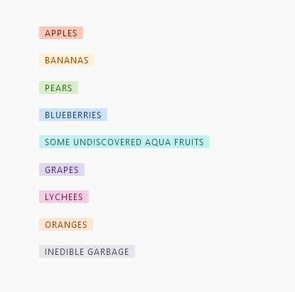
examples of zui-tag

Get the code
<div class="container">
<zui-tag color="red">apples</zui-tag>
<zui-tag color="yellow">bananas</zui-tag>
<zui-tag color="green">pears</zui-tag>
<zui-tag color="blue">blueberries</zui-tag>
<zui-tag color="aqua">some undiscovered aqua fruits</zui-tag>
<zui-tag color="purple">grapes</zui-tag>
<zui-tag color="rose">lychees</zui-tag>
<zui-tag color="orange">oranges</zui-tag>
<zui-tag color="gray">inedible garbage</zui-tag>
</div>
<style>
.container {
margin: 5rem;
display: flex;
justify-content: center;
flex-direction: column;
gap: 1rem;
}

zui-tag {
display: inline-block;
}
</style>

Documentation for how to use these tags, such as when to use certain tag colors, is still in the works. We'll be updating this page with more in the days to come.

In March, we refactored the Dialog component to use the native <dialog> element under the surface. With that enhancement, we were finally able to complete a key feature to scrolling within Dialogs: sticky the footer so actions are always visible to users as they scrolled down a Dialog with lots of content. We also took the opportunity to style the scrollbar to be less intrusive by making it narrower and minimal in design. This scrollbar style can be seen throughout our components that have the possibility of scrolling, such as in the Dropdown multi-select and Dropdown select components.

Example of a Booster Dialog with a stickied footer when the content exceeds the height of the Dialog and a scrollbar appears

There are no changes that consumers of this Dialog component need to make. Win!

Enforcing consistent form label layout

One of the primary goals of <zui-formfield> is to ensure all form labels are consistently placed. During an assessment of form consistency across our apps, we found that a majority of forms have been implementing labels stacked above form fields; contrary to how we set up <zui-formfield>. We reassessed our guidelines and agreed it made more sense to adhere to what our apps are already doing.

Before and after form label updates

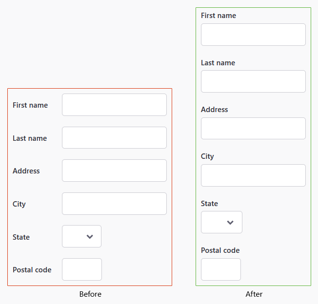
This change shouldn't break functionality in apps, but we do encourage you to double check and make sure the design and layout of your current forms utilizing <zui-formfield> aren't broken.

Tracking utilization

Continuing on our objective to gain insights to what components are being utilized, we are now beginning to track the utilization of all ZUI and ZAPI components.

For applications that use <zywave-analytics>, we will be sending information to Heap for tracking the number of instances our components are on each page. We'll be using some control mechanisms to make sure we aren't too chatty and getting in the way of critical performances, and won't grab any analytics at all if on worse connection types, where a user might be using mobile data.

Monitoring to improve bundle performance

A goal of ours in the recent months has been to attempt reducing the footprint ZUI has on the initial load times of Zywave's applications. Given that ZUI is a critical component of most features, it's unfair for us to take up as much bandwidth as we currently are with our standard bundle. As we work to decrease this footprint, we realized we needed some monitoring in place to see just how much we're affecting change in our bundle.

To start, our merge requests have been configured to present the difference in bundle size between the target branch and the source branch. We'll likely continue to enhance this and have some follow up blog posts in the future to share what we do as we believe others should do this as well.

Example of metrics reports on GitLab merge requests

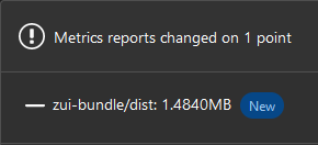
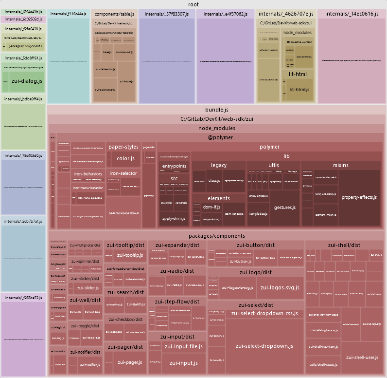
In addition to the metrics report, we also included a visualizer to see which modules are taking up the most space in our monorepo. This will give us a better idea of what to improve in order to minimize our bundle's footprint.

Metrics visualizer of ZUI monorepo

Full changelog

As always, if you want to see all of the activity that went into this release, feel free to check out the milestone in GitLab.

Feedback