<script type="module" src="https://cdn.zywave.com/@zywave/zui-bundle@latest/dist/components/table.js"></script>import "https://cdn.zywave.com/@zywave/zui-bundle@latest/dist/components/table.js";Usage
Use tables to help users visualize, organize and understand their data to derive insights and take informed action.
General best practices
- Don't stretch tables - unless the data within the table requires it, use our fixed width (1000px) page layout. Adding unnecessary space between columns makes it harder for the user to read and digest the information.
- Table columns should be sized according to the data they contain.
- Unless it helps with readability remove everything in the design which is not data or white space. Minimize styling, maximize information.
Cell data alignment
- Generally, you should align text left and numbers right if the numbers are going to be added up or compared to each other
- Right align numbers when the are monetary values, this allows you to easily compare values and the decimal point lines up
- Leave text ragged-right, do not justify
- Year, date, and time should typically be right aligned
- Align headings with their data
- If the column only displays monetary values and it's obvious to the user, then you can remove the '$' and add that information to the column header
- Align the $ symbol next to their value, unless the table uses vertical column dividers, then align the $ symbol to the left of the cell and the value to the right
- Be consistent with the decimal point, if you choose to show two decimal values, always display them
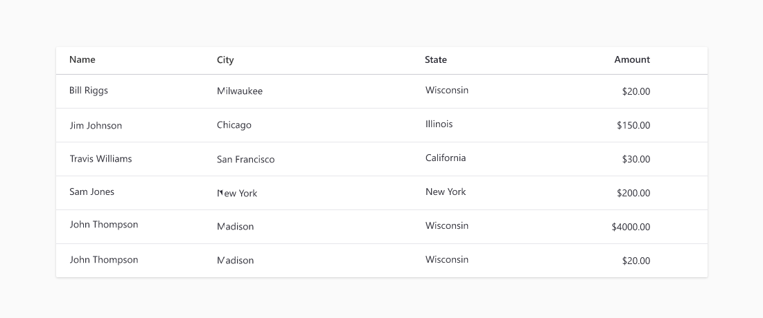
Example of typical cell data alignment, text left aligned / numbers right aligned.
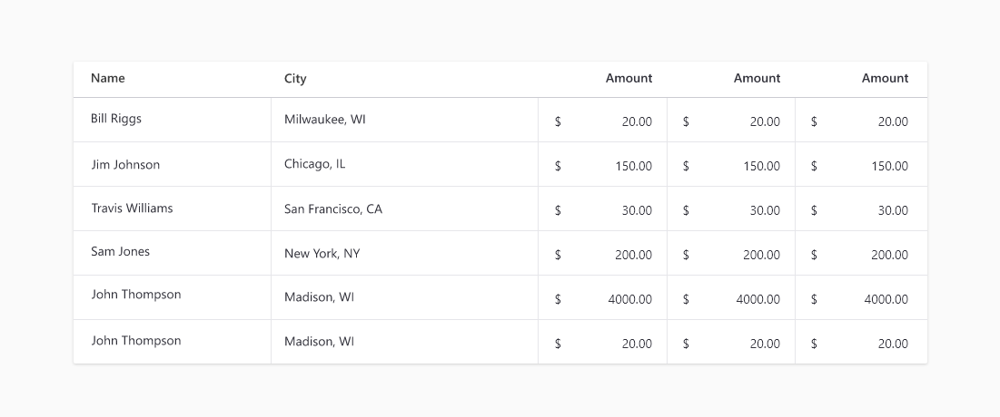
Example of monetary values in cells with vertical column dividers, aligning the $ symbol to the left of the cell.
Content guidelines
- Headers should use sentence case
- Keep number formatting the same throughout the table. For example, always use the same number of decimal points.
Types
Base table
Anatomy
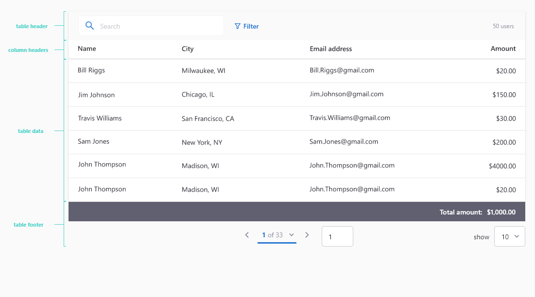
Tables typically use cards as their container(s).
- Table header (optional) - the container that can include: search, filters, actions, number of results
- Column headers (required)
- Content rows (required)
- Table footer (optional) - the container that can include: pagination, a summary row that displays a grand total of values
Sizing and spacing
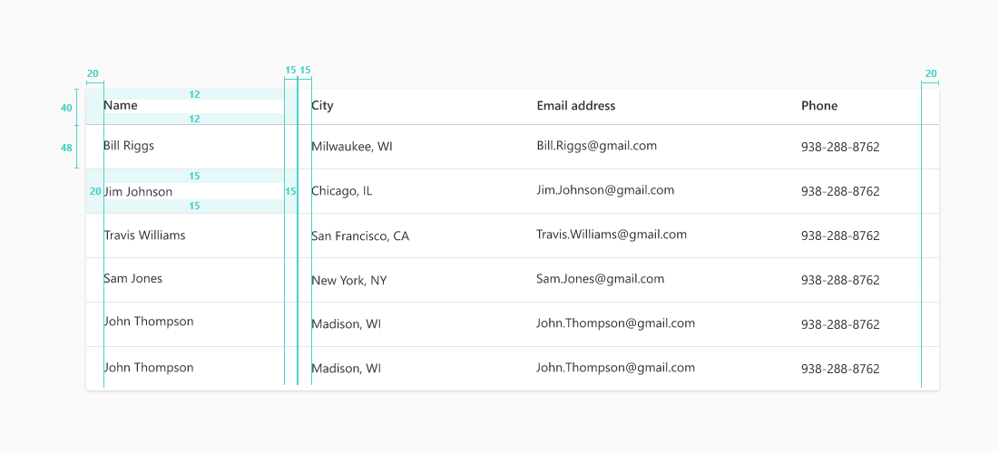
To remain consistent all tables should use the following basic design specifications.
- Table Header height - 60px
- Column header row height - 40px
- Data row height - 48px
- Table padding - 20px left and right
- Cell padding - 15px
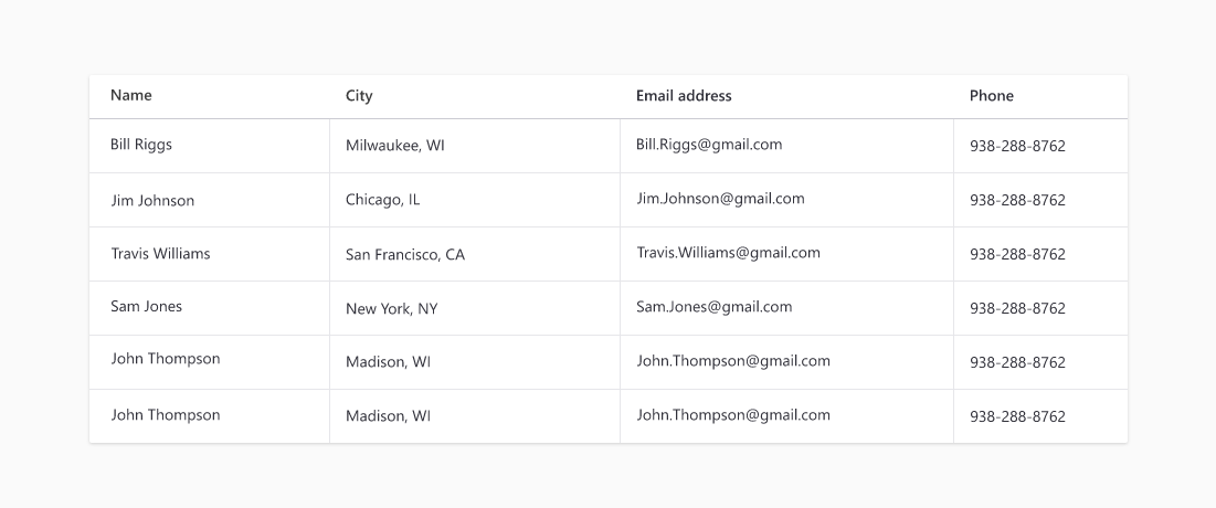
Adding vertical column dividers
Add vertical column dividers judiciously and preferably not at all. Add them if extra clarity is required, or when you have many columns and they get too close together.
Row banding
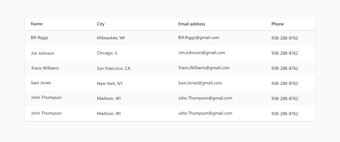
In most cases avoid banding. They can distort the meaning of the data by highlighting every other row to the detriment of neighboring rows and can cause user distraction. If the rows become hard to follow, particularly when the information is complex, there is considerable space between columns and/or the user is required to scroll horizontally, adding banding will help.
If the table uses row banding, it does not need row dividers.
